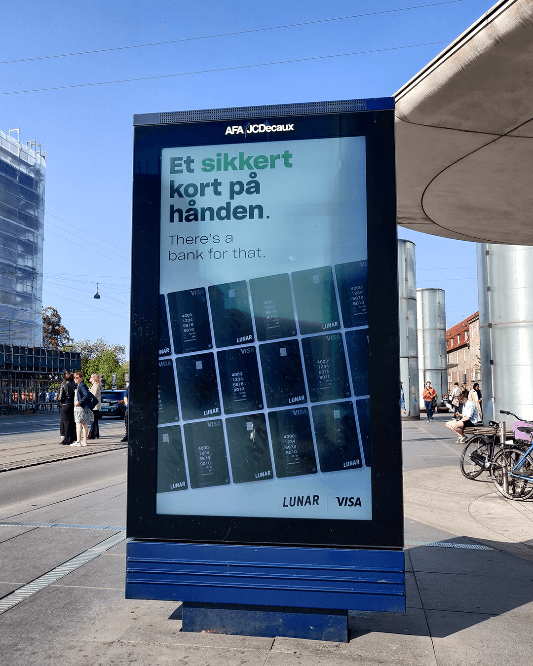
With more than 1 million customers, Lunar is a forward-thinking Danish fintech bank operating across Scandinavia. Its mission is to make banking more human, accessible, and simple through one intuitive app.
As a Motion Art Director, I worked on developing and evolving a visual style that translates this vision into motion. My work formed the foundation for campaigns with a dynamic, energetic, and recognizable look. In these, motion is not just supportive, but leading—always designed with the user at the center.
Motion as a brand language ↗
The motion style is built around movement and growth. Animations consistently move upward (↗), expressing progress and ambition. The core values of Lunar.
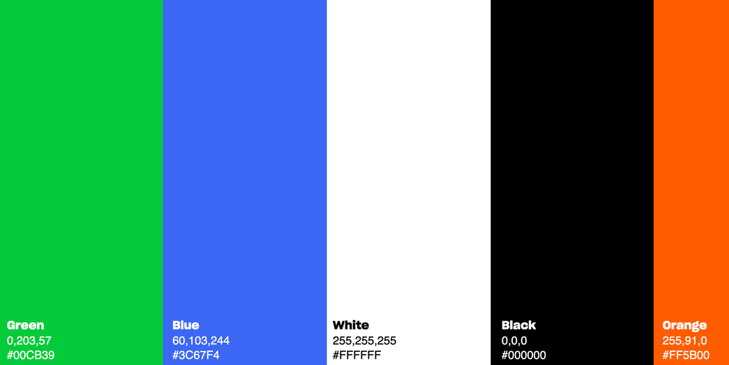
Combined with a strong typeface and bold colors, this creates a dynamic and cohesive motion language.
The rhythm is fast, poppy, and energetic. Elements often move and grow along with the arrow, making animations feel both playful and purposeful. In this way, motion brings Lunar’s brand vision to life in an accessible and consistent way.
The visual style was rolled out across all of Lunar’s markets: Denmark, Norway, and Sweden. From commercials and social content to UI animations and outdoor applications. The same energy, timing, and dynamism are consistently present throughout.
By using a universal rhythm and reusable animation principles, Lunar remains recognizable regardless of the channel or objective. In this way, motion acts as a unifying layer within the brand.